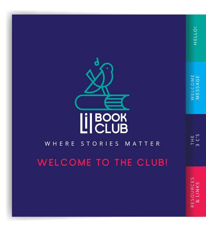
LIL BOOK
CLUB
Visual Identity Design
Lil Book Club is a community-based program that promotes early literacy and social-emotional learning through curated books, art kits, and custom songs. I was tasked with creating a playful, kid-friendly brand identity, followed by a responsive website and simple packaging design.
Starting with sketches and client feedback, I developed a visual system that reflects the heart of the program—creative, warm, and connection-focused. The final result gave Lil Book Club a much-needed upgrade and a cohesive, professional presence.
In the early stages of the Lil Book Club identity, I explored a series of hand-drawn logo concepts centered around the idea of a songbird—a symbol of learning, growth, and creativity. The bird not only sings, but also builds, mirroring the program’s focus on helping children develop emotionally and intellectually through storytelling, art, and music.
Many of the sketches combined the bird with book elements—open pages forming wings, perched birds on books, or nest-like shapes built from story pages. These visual metaphors helped connect the name "Lil Book Club" to its mission: helping young learners build, sing, and grow through curated, heart-led experiences.


